Thumbnail First, Tracklist Later: The Visual Shorthand of the UK Mix Cover

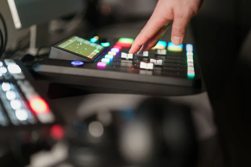
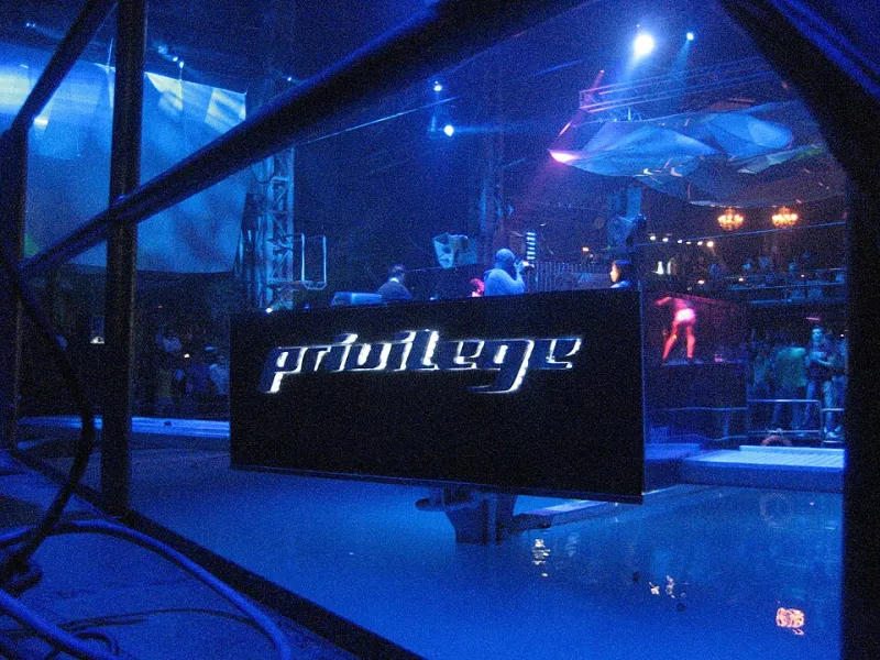
Photo: HA! Designs - Artbyheather, CC BY 2.0, via Wikimedia Commons
A mix lands in the group chat. Before anyone taps the link, they see a square. It might be a photocopied flyer with a crease down the middle, a phone photo of a booth so blurred it could be any basement in any city, or a handwritten label stuck to a white sleeve. Nobody has heard a bar yet, but the cover has already said something. In 2026, the UK mix cover is less decoration than a first handshake — and selectors know it.
The 200-pixel audition
Most mixes are not discovered on a hi-fi. They are found on a phone, in a feed, at the size of a postage stamp. That constraint has changed what artwork needs to do. A cover has to read at thumbnail scale: one shape, one texture, one half-legible scrawl that survives compression. Elaborate designs that look handsome on a laptop often turn to mush in WhatsApp. The covers that work are the ones that behave like a logo without trying too hard — a strip of colour, a blurred figure, a stamped title that still says something when it is the size of a fingernail.
This is the quiet test every UK mix cover now faces. Not “is it beautiful?” but “does it create a small, instant question?” The scanned flyer asks: where was this night? The blurred booth shot asks: who is behind the decks? The handwritten label asks: what is on this and why does it matter? A good cover does not answer any of that. It just makes the thumb hover.
Lo-fi is a language, not an accident
The current crop of covers leans hard on imperfection. Scanned rave flyers with fold lines and bad registration. Photos taken from the side of the booth, lit by a single red bulb. Centre labels written in biro, sleeves that look like they have been in a crate since the nineties. None of this is new — the photocopied flyer aesthetic has been borrowed and returned for decades — but in 2026 it functions as shorthand.
Lo-fi says something about intent. It suggests the selector is more interested in the archive than the algorithm, more at home in a record shop back room than a content studio. It is not a guarantee of quality. A blurry photo can hide a lazy selection as easily as a sharp one. But as a visual cue, it signals crate-digging instinct: the mix is likely to be built from records that were found, not sent over. For a listener hunting their next favourite set, that is useful information before the first track even loads.
There is also a practical reason for the rough edges. A lot of UK mix artwork is made by the selector on a laptop at 1am, after the recording is finished. It is a scanned flyer from their own collection, a photo from their camera roll, a label designed in a free editor. The cover carries the same DIY energy as the mix itself. That honesty is part of the appeal. A slick Photoshop job can feel like a promise the audio has to keep. A scruffy sleeve feels like a note passed under a door.
Series identity and the grid
Where the single mix cover is a handshake, the series cover is a uniform. UK mix series have become good at building a visual identity that works across a feed: a fixed typeface, a repeating border, a colour palette that shifts with the season. You can spot a new instalment before you read the title. That consistency is not just branding for its own sake. It tells the listener what kind of listen they are in for — the late-night series, the warm-up series, the deep-crate series — and it makes the archive navigable.
The grid has changed the design brief, too. A cover that has to sit next to twenty others needs to hold its own without shouting. The best series artwork tends to be disciplined: one strong image, one clear title, one piece of information. It leaves room for the mix to breathe. When every sleeve in a series is a collage of fonts and stickers, the whole feed becomes noise. The quiet covers are often the ones that build trust.
The cover as contract
There is a mild fiction at the heart of mix artwork: the idea that the package can tell you what the sound will be. Sometimes it can. A greyscale cover with a typewritten tracklist often signals a heads-down, home-listening set. A saturated flyer with a cartoon font often signals a party. But the relationship is loose. Plenty of brilliant mixes wear terrible covers, and plenty of beautiful covers wrap ordinary selections. The sleeve is a cue, not a review.
Still, the cue matters because attention is scarce. A listener scrolling a feed is making a split-second decision about trust. The cover is the first evidence of taste. It says: this person cares how the thing is presented. That does not mean they have made a great mix, but it does mean they have thought about the listener’s first contact with it. In a market where anyone can upload anything, that thoughtfulness is a signal.
What the sleeve cannot do
It would be easy to overstate the power of the cover. No piece of artwork has ever made a weak mix good. The UK scene is full of selectors who spend hours on the tracklist and five minutes on the image, and that is fine. The music does the heavy lifting. But the cover is the doorway. In 2026, with more mixes than ever and less time to sift them, the doorway is doing more work than it used to.
So the next time a square appears in the group chat, pay attention to your own thumb. Does it pause? Does it ask a question? Does it make you press play before you know a single track? That is the quiet art of the UK mix cover — not a substitute for the set, but a reason to start it.